


Well, there are a lot of ways to do that, but the best ones take into consideration the needs of their users first and then work their way up. For example, in the year 2018, the winners of MUX awards - (an award for best mobile user experience designs) were iflya380, seeing AI and Masterclass.
I noticed one common thing in all of these apps, they were all using my phone's full display from end to end, there wasn't a single white gap between any two sections that I scrolled through, and each element on the screen was placed perfectly, where my fingers could easily reach.
In a way, it was super easy for me to navigate through all of these apps and each screen made me want to click on a button and go on to the next one. I was fascinated with the uber simplicity of these apps and yet they looked so ultra-modern.
So I researched more about making a better UX design and came up with the following steps to make your UX design look more appealing.
Step 1: Choose an appropriate colour scheme
Before you start imagining an app design, understand the primary and secondary colours, it's very important because of a few factors mentioned below: -
- It directs the users' attention to your product or service within the app if done right.
- It helps the user spend more time on the app without getting distracted.
- It helps the user to relate better with your app or website.
- Dark backgrounds use less power compared to light backgrounds and save battery.
- Gives you the edge to use your screen space well.
Step 2: Understand your primary features and showcase them well
Most app owners always feel that their landing page is not quite right even after launching the app or website, it's because of mainly two reasons:
- Either it shows less information of value.
- Or it shows too much information on one page.
I have worked with a lot of app owners and trust me when I say this, 'they really can't figure out the thin line between under-doing it or overdoing 'it until they find a good UX designer and this wastes a lot of their time.
When I say 'understand your primary feature and showcase it well' I don't mean that there could be only one primary feature in your app, there could be multiple primaries and you have to balance them all.
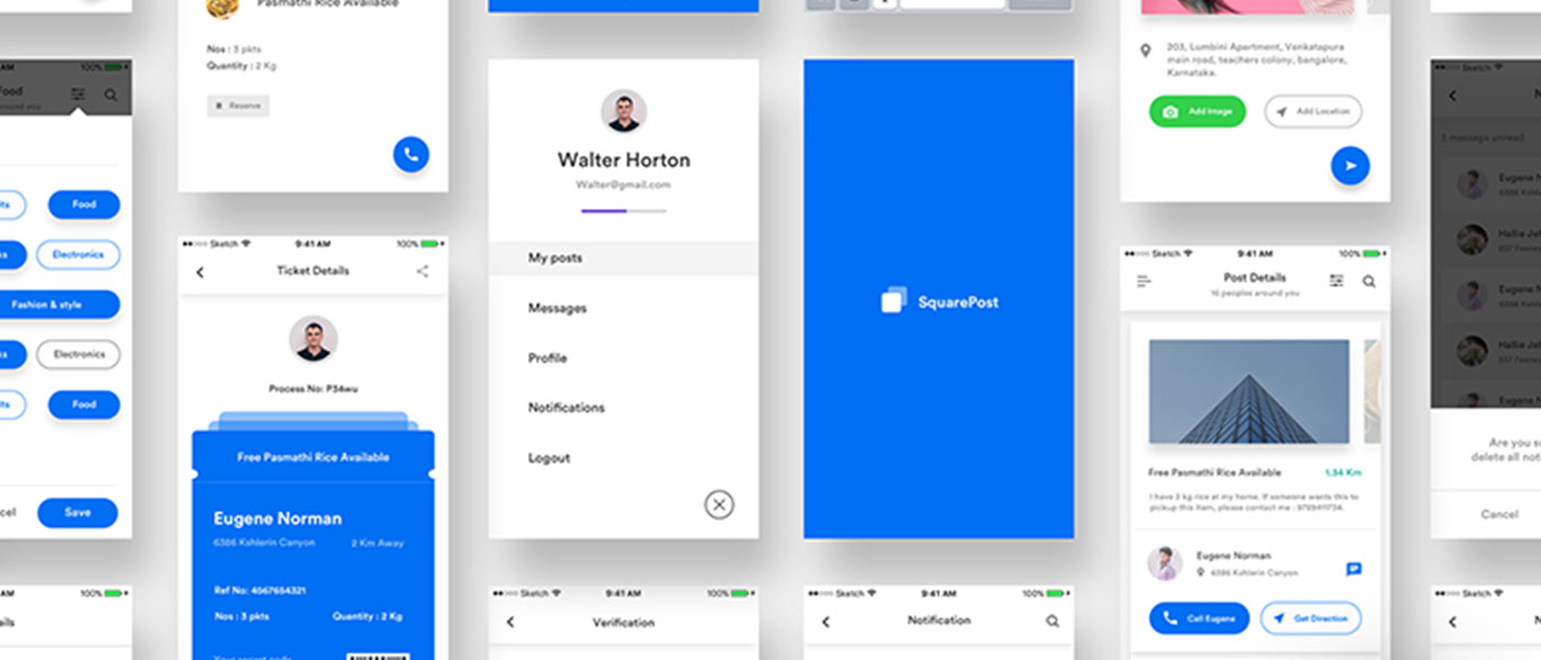
For example, in the app iflya380, all of their objectives are more or less primary starting from selecting your destinations to pointing your camera out of the window at the time of landing to see attractions. But while using the app you'll notice that they have given equal importance to each step in a users journey and have provided the users with the same amount of information as in any other of their steps.
So, if you have multiple primaries, try to give each primary equality of display space and display time, which increases the time spent on the app and helps your user to identify your features well.
Step 3: Make Navigation Super easy to follow
Navigating through some apps is really like a nightmare at times because of the energy they take out of you in order to accomplish simple tasks. Like booking a flight ticket on TripAdvisor or any other travel website is really a harrowing task. Don't be like that! and don't clutter your display with offers, discounts or advertisements because it makes navigating through the app even more difficult.
Be easy on your users, have self-evident navigation points and highlight them well. If a user has to look for a button on the screen to go on to the next screen then your score might drop in the near future for user retention.
Step 4: Aim to make the user work less and get more information
In order to be good at design, you have to make your users work less and get them more value out of their actions. To complete one task, the maximum number of clicks or actions a user can take should be less than 5. Ideally, the user should get the information they are looking for in one click and I mean all of the information they are looking for but we all know that it's not feasible. Thus keep your actions and results in sync and try to have a minimalistic actions approach in your design.
It works like magic when the user gets more information than expected in one click. Because information is valuable and Navigation shouldn't take your users away from your content. Instead, it should point the user towards the next step or piece of content and make them irresistible.
Step 5: Be Interactive in your designs
Create your designs in such a way that when a user takes any action on the app they must know that the action has been acknowledged and feedback is under process. If a user doesn't know whether the click went through or not, they get very impatient and try to take the same action again which just doesn't help.
Follow the users' journey on the app and let them know where they are on the app, where have they come from and where exactly would they find the information they are looking for. Rather than recording their actions, record their whole journey and predict possible outcomes for them to choose from so that they don't have to figure something out. Make everything seamless and easily accessible.
Overall, design and user experience is a field of vast magnitude and no one strategy could help you succeed. But correct principles before you sit down to design does help weed out all the unnecessary complications you might face and helps you focus on the good things which make your UX unbeatable and different from the rest. Keeping it simple is the new cool. Be cool.