Minimalism is back. The first sign of this lifestyle trend started back when the first recession happened. Now it has become a style that has been adopted by the digital world. Unlike the long-gone days of myspace, no web design is cluttered (at least not any good ones). Overcrowded pages are not good visually for a user. The first adoption of a minimalist design was brought on by Google in the 1990s.
After the introduction of this trend, it has been continued until this date. Most UI designers have adopted the principle of less is more. This principle is directly related to clarity in design. Having less features on-screen helps the audience concentrate on the important aspects of the design and information. Clarity one might say is subjective but I disagree. Importance in a UI is decided by one person. That person is the designer. Another benefit of having less features on-screen is the decreased loading time. Thus decreasing your bounce rate.
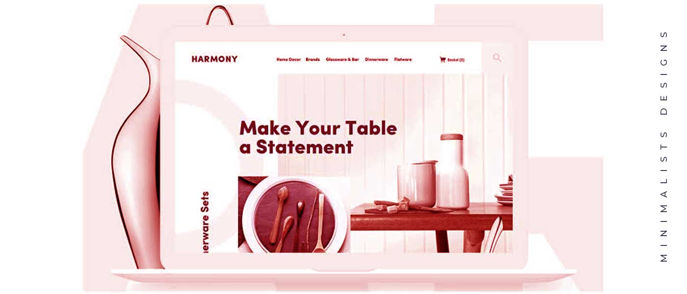
A minimalist design, however, does not mean that you keep the whole page blank. It is, on the contrary, a design concept that requires thought and the use of some basic rules to be effective. Here are some techniques that make the web page effective while using a minimalist design basis.
Remove All Extra Elements
Within the hemisphere of a design ideology like minimalist, every element that you put in needs some amount of justification behind it. There is no room to be accidental. Each element needs to be able to serve a purpose.
Since the design is so basic, the components stand out and are highlighted. Communication is brief and to the point. The same way you can't use stock images you also can't put unnecessary words on the page. Everything meaningful needs to be on the page, how you choose to deliver the message is your choice. All it needs to be short and sweet. The other reason for this is also that the reduction of information can often lead to confusion in the user creating a lapse in the UI.
Create A Single Focal Point
As you strip away the screen of all unnecessary elements, the one that remains stand out even more. In the minimalist design, philosophy content is given the first priority and everything else is designed around it. The goal is to make the message more clear with the removal of not only all other distractions but also by keeping the focus centered on the content. This also helps in highlighting your CTA in a manner that does not seem too promotional.
Be Careful About Your Color Scheme
The color scheme you finally decide to go with needs to consistent. Minimal doesn't mean that you can only select a white or neutral background. It does, however, mean that you have to stick to a theme. Your color needs to fulfill two functions: one is to accurately portray your design and the other is to create a hierarchy.
The need to make a choice strategically and use colors to direct attention. You can use bright, bold colors as long as you manage to make it look balanced. The use of negative space and the choice of non-disruptive color patterns is a must. Also, pay special attention to your logo. Generally, a logo is a small element of your website, but in the case of minimalist designs, they become extremely important. They might actually even be the first appearance of the color story that will be the center of your website.
Be Smart About Whitespace
The moment all the unnecessary elements leave the screen there are empty spaces that take over the screen and these can make or break your website. This empty space is called negative or white space. It is also additionally referred to as the backbone of all minimalist designs. It does not even have to be white, it does have to be empty. Even though this space is empty it still has seen very important functions to complete. It is preventing anything from disrupting your messaging and it is also helping viewers get the exact information they need from the screen.
While you're creating negative space keep in mind a couple of things
Importance of content
Hierarchy of elements
Simplicity of messaging
Performance on various devices
Flat Textures
These are textures that are devoid of any kind of gradients, highlights or special graphic effects, These elements are visually simple and minimalistic. However, the issue with creating every element flat does not translate to a minimalistic website. Flat and minimal are two different concepts. They do, however, show up time and time again together.
A website with a 3D animation using gradients and shadow might even end up looking really minimal. Flat design is recommended because it is just easier for certain designers to work better when both those concepts exist on the same website.
Large Background Elements
This was a technique that came to light in around 2018 and it is still going strong. A large video or picture on a single page helps divert attention and get the central message of the page across. This element is executed by first setting a background image and then adding parallax. This fulfills the criteria of originality as well as minimalism.
The whole concept of minimalism pushes the whole background to the forefront of design and thus needs to be carefully thought about.
Special Focus On-Grid Layouts and Top Area
These are very popular amongst the minimalist designers as they provide the perfect structure to build the website. It makes the content placement much easier and you don't even need to worry about its look on different resolutions. The placement takes care of that. There is also no overload even when content is constantly being updated.
Minimalism is the way to build a website. Even though it does seem like an extremely constraint way to build a website. It is anything but that. It is the restrain that you show on your website that in the end will be the only thing getting any kind of traffic on your website.